Recognizing the need for a unified design strategy across its product line, Harvest tackled challenges such as disparate user interfaces, extended design cycles, and the struggle to maintain a consistent brand identity.
Over the span of a year, we established processes, introduced new work tools, and laid the groundwork for the Porchlight design system. This initiative was implemented with dedicated design and engineering resources specifically allocated to the design system.
My responsibility was to lead the creation of the design system, overseeing a dedicated team to bring it to fruition. I played a key role in roadmapping, UX/UI design, engineering, and documentation of the design system, ensuring its accessibility in design, and successfully integrating it across our products.
Problem
The absence of a comprehensive design system has resulted in a disjointed user experience. Ad-hoc approaches to website technology and design have led to fragmented workflows and inconsistent brand encounters. Here are the identified issues:
Lack of Guidelines and Direction
- Objective: Align our teams by providing a structured and guided approach to product development.
- Solution: Introduce comprehensive guidelines to streamline the creation of products.
Elimination of Component Duplication
- Objective: Expedite the design and development process by reducing redundancy in common components.
- Solution: Implement a library of standardized patterns to enable teams to create and test layouts more efficiently.
Poor Accessibility
- Objective: Enhance the accessibility and inclusivity of our products.
- Solution: Integrate accessibility features into our component libraries, addressing both design and code repositories to ensure a more accessible user experience.
Inconsistencies Across Products
- Objective: Improve brand perception and trust through consistent experiences.
- Solution: Establish uniform experiences that cater to everyone, enabling people to achieve their goals seamlessly.
By addressing these concerns and implementing a robust design system, we aimed to create a more cohesive and user-friendly environment, fostering better collaboration among teams and elevating our overall brand image.
Challenges
While the incorporation of a Design System holds significant potential for enhancing Harvest, our team faced several notable challenges in its adoption:
- Complex Migration Process: Transitioning to a design system posed a challenge due to the extensive number of components distributed across various products and toolchains. The sheer scale of this migration demanded careful planning and execution.
- Ongoing Commitment to Maintenance: Recognizing that a design system is a dynamic entity, sustained commitment from leadership was crucial. Regular maintenance, requiring dedicated time within our project cadence, was imperative to ensure the system’s continued relevance and effectiveness.
- Decision-Making for System Evolution: The maintenance process included decisions about incorporating new patterns, modifying existing ones, and potentially phasing out outdated patterns. Apart from the actual implementation, significant time and effort were required to facilitate team discussions and secure buy-in for these decisions. This collaborative aspect was integral to the system’s evolution.
Addressing these hurdles strategically paved the way for a smoother integration of the Design System into our workflow, ultimately optimizing our design and development processes.
Collaboration and Teamwork
Working closely with the engineering team, I designed the visual look of the components and collaborated on their implementation by creating the necessary HTML and CSS. This close collaboration helped ensure that the components were both visually consistent and technically feasible across our products.
Our work reduced the design time by 40% and development time by 25%, enabling us to ship features faster and with greater consistency.
UI Inventory
To gain deeper insights into the current landscape of our design ecosystem, we initiated a comprehensive UI Inventory focusing on our key interface components. We meticulously documented unique instances of critical design assets, encompassing elements such as typography, buttons, icons, input forms, drop-downs, etc., and centralized them within a collaborative Figma file.
This meticulous examination uncovered a multitude of inconsistencies within our design assets, underscoring the imperative for a more methodical approach to documenting, communicating, and sustaining our design system.
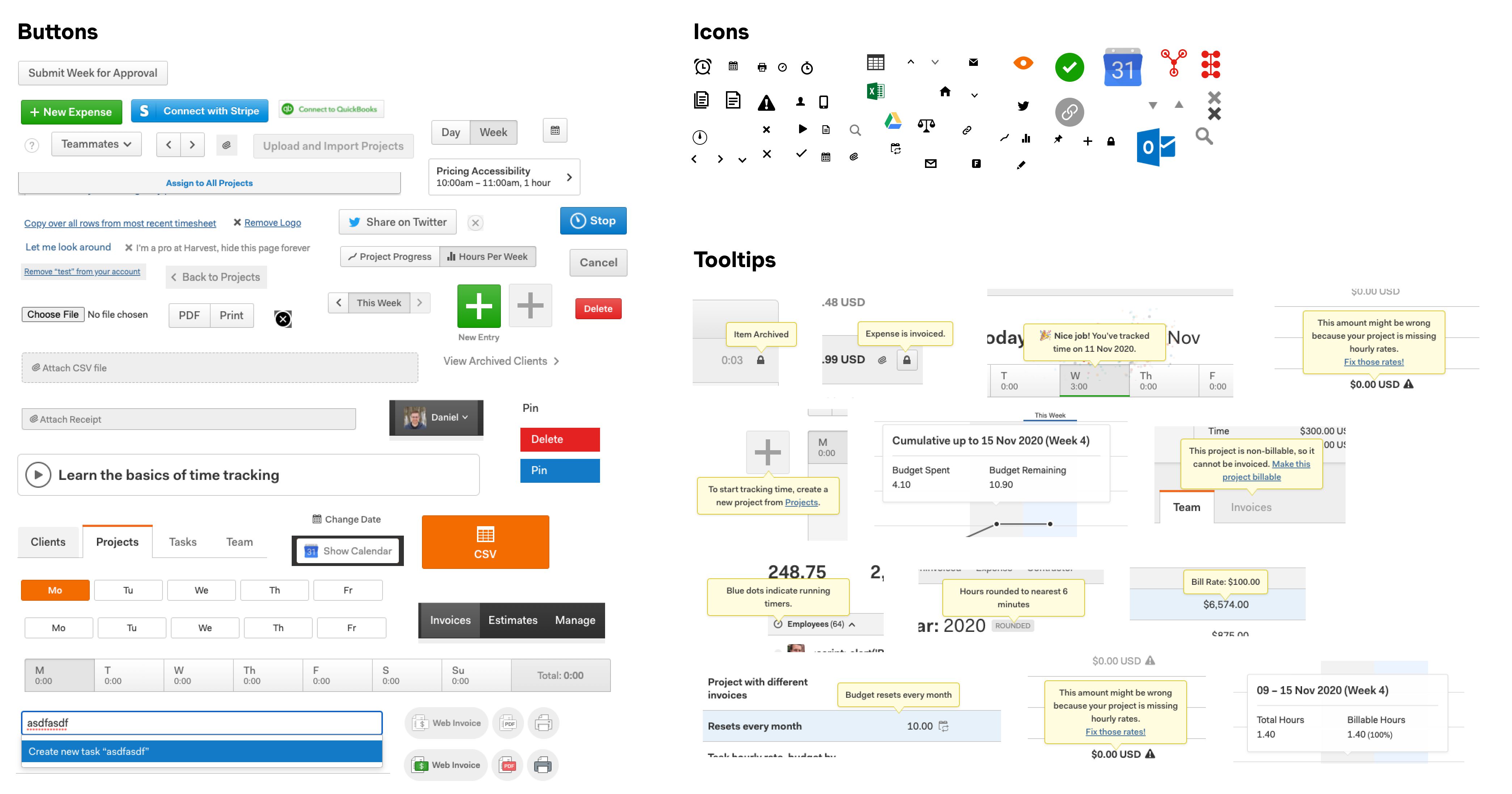
The inventory process proved instrumental in highlighting discrepancies and incongruities throughout our site and product, establishing a robust foundation for our subsequent design system endeavors. Armed with the audit findings, we curated a list of core components that would form the cornerstone of our design system.
Foundations
Critical to the success of the system was the alignment of all our teams on the foundations. Porchlight is structured to be scaled, meaning that our foundational system needed to account for every potential UI element. Our foundations include a grid system, breakpoints, spacing, and color systems.
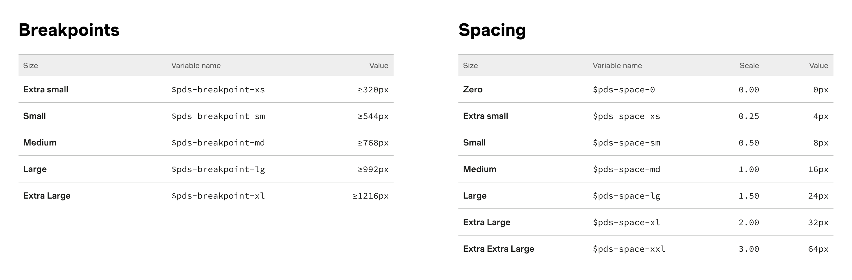
We introduced a typescale based on display headings, utility headings, paragraph styles, and supporting styles. This comprehensive approach ensures scalability and consistency.
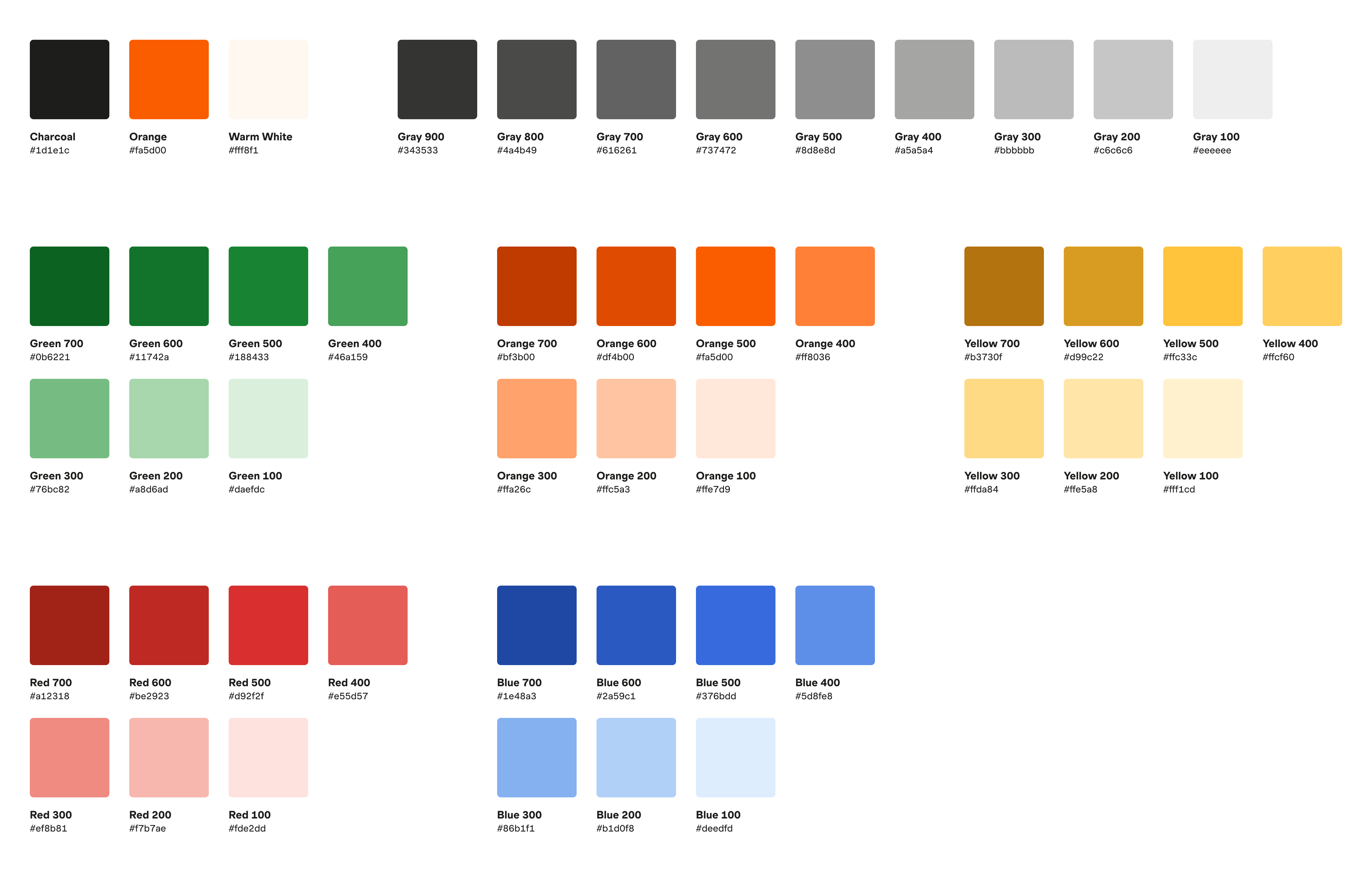
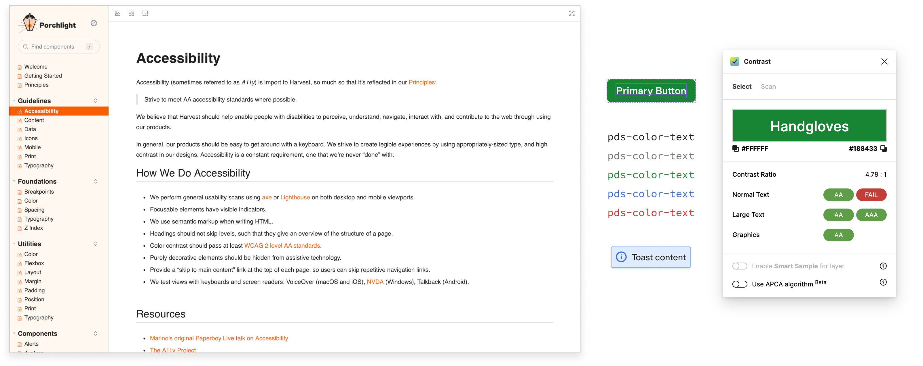
Our color scale enables a branded palette that remains flexible with light and dark color variations while adhering to WCAG AA minimum contrast accessibility standards.
Components
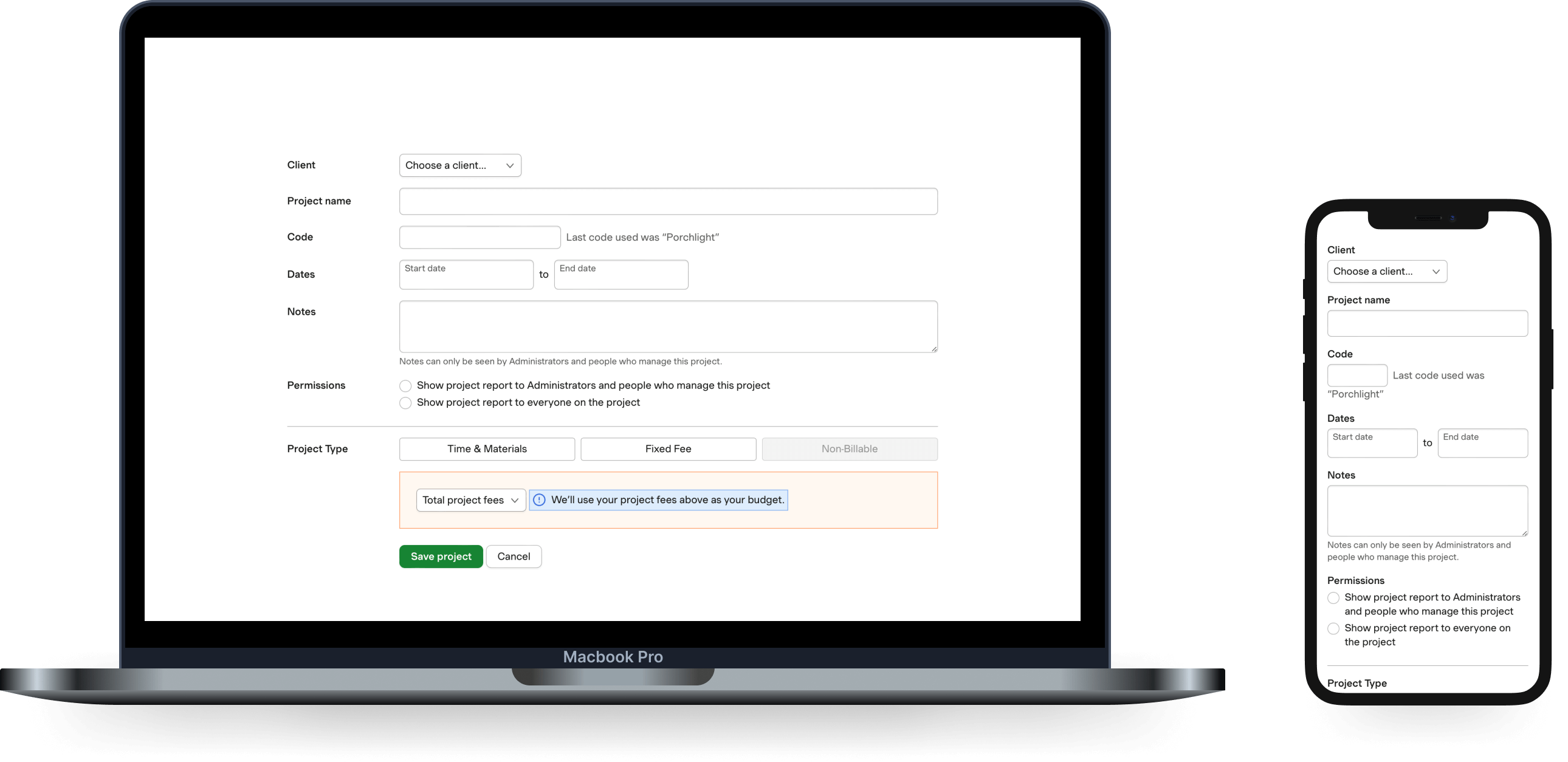
We’ve created a comprehensive set of reusable interface elements for integration throughout Harvest products. These elements are constructed on a solid foundation to ensure consistency and durability. They prioritize accessibility, responsiveness, and adherence to Harvest branding, thereby maintaining a uniform experience across our product range. Notable examples include buttons, form inputs, grids, and tables.
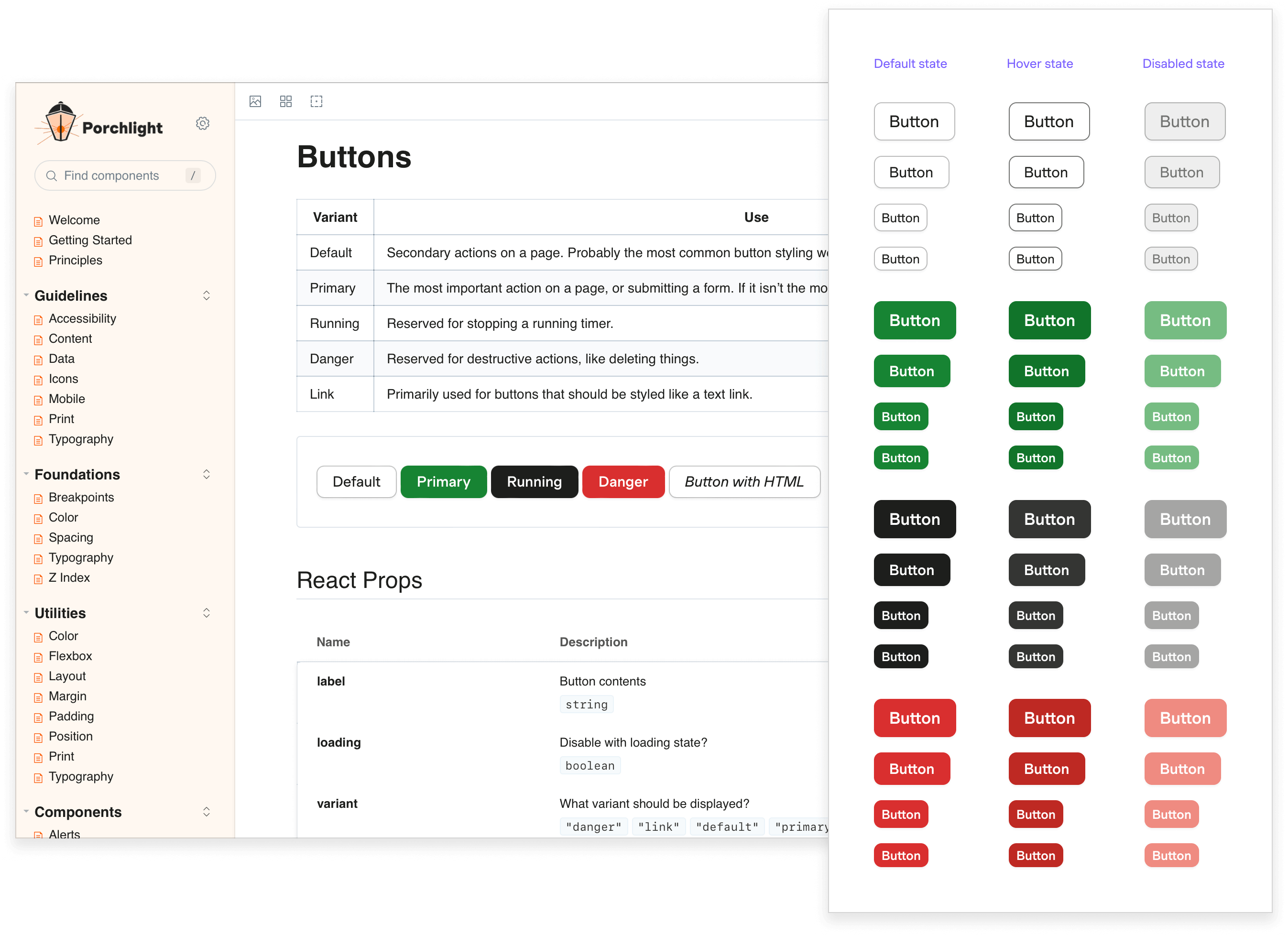
To enhance understanding, each component comes with detailed interaction examples, clearly illustrating expected interactive states. These are complemented by specific specifications covering tab stops, keyboard control requirements, spacing, and application.
Moreover, each component undergoes meticulous refinement to accommodate additional breakpoints. This meticulous process ensures our components perform seamlessly across a diverse range of devices, allowing for a consistent and reliable user experience without the need for unnecessary adjustments.
Accessibility
One of Harvest’s design principles is Treat customers like real humans. We were insistent on making sure we built components to be accessible to customers with disabilities. Each component was designed with accessibility in mind, striving to comply with WCAG AA accessibility standards.
We aimed to involve all internal teams in the process by offering transparent explanations, comprehensive documentation, and educational materials about the UX team’s initiatives to develop an inclusive system. Shortly after implementing the Porchlight Design System, a customer shared:
“Thanks to Harvest’s commitment to accessibility, our team members with visual impairments can now use the product seamlessly. Our blind users have reported that they can now accurately use all features of Harvest, and it has significantly improved their workflow.”
Workshop Environment
Our experience revealed the challenges of maintaining design and code consistency across various products, prompting us to develop Porchlight in its dedicated environment.
We chose to construct Porchlight using Storybook, an open-source, versatile tool enabling the creation of an interactive pattern library for code in isolation. Storybook is compatible with all major frontend frameworks, facilitating the documentation of use cases as stories and offering seamless sharing and reuse.
Within our workshop environment, we seamlessly incorporate integration tests using Puppeteer, perform visual regression testing through Chromatic, and implement code linting with Prettier and Stylelint. These tools collaborate harmoniously, ensuring that our work consistently meets and surpasses high-quality standards. This allows us to feel confident in using Porchlight in our products.
Documentation
Effective component documentation is pivotal for a functional library, enabling swift and uniform decision-making for everyone involved. Our aim was to produce comprehensive documentation covering every facet of our design system, ensuring it is well-organized, consistent, and user-friendly.
Design principles serve as a guiding force in the development of new features or products using Porchlight. This ensures a unified direction, enabling everyone to work towards the same goal, facilitated by the design system.
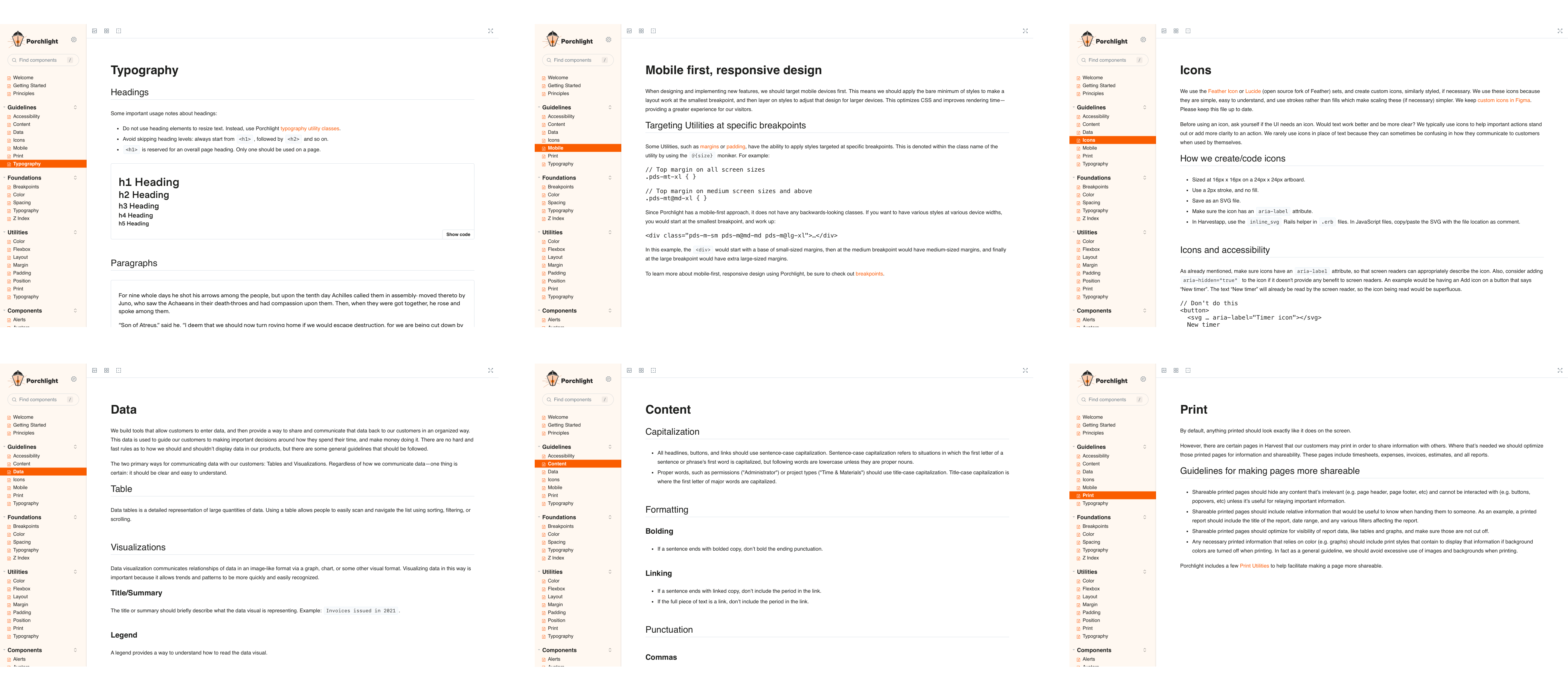
Guidelines serve as essential knowledge for Harvesters, detailing optimal utilization of the design system. They explain our approach to crafting and constructing Harvest products. These encompass topics such as accessibility, voice and tone, icons, printing, and more.
Tracking Progress
To efficiently manage and communicate the progress of tasks related to the implementation of Porchlight into our products, we leveraged GitHub Projects, providing universal accessibility within the Harvest team. GitHub Issues were generated to categorize and address specific tasks, and these were then assigned based on their priority. This streamlined approach allowed us to report real-time progress to stakeholders, providing them with access to all pertinent information. This comprehensive system ensured a smooth transition and enhanced visibility into the implementation process.
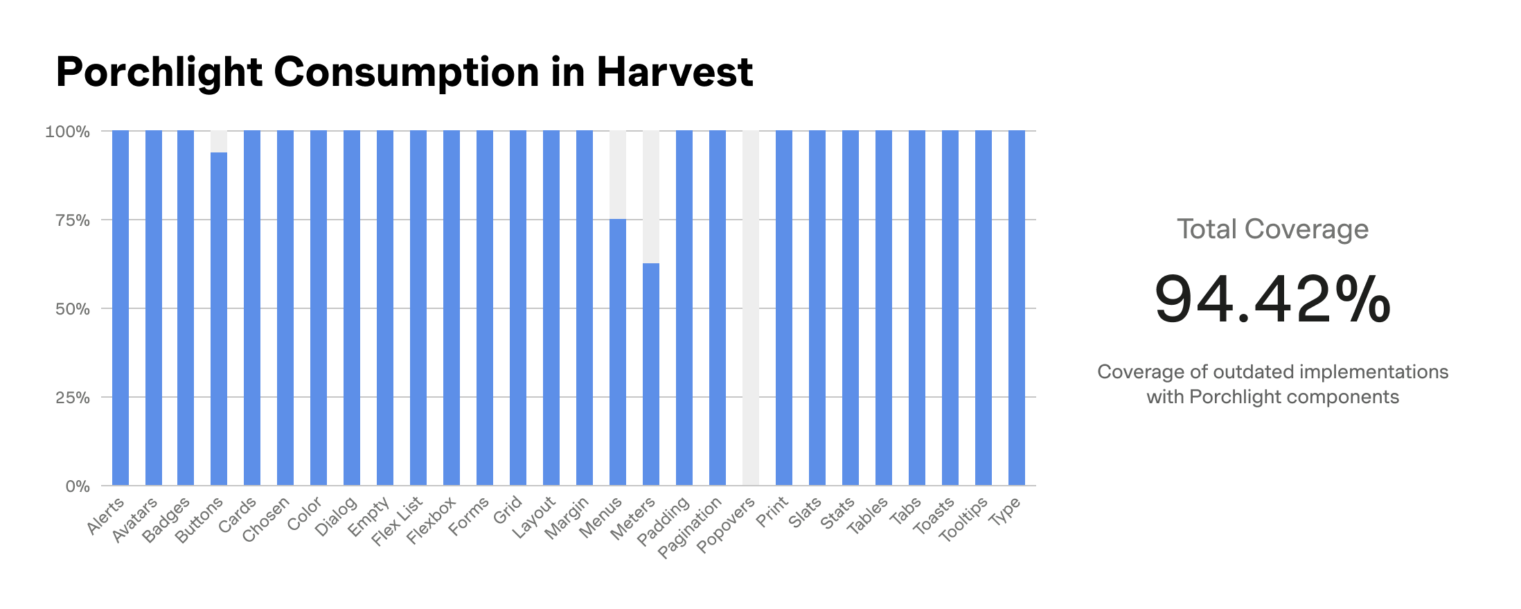
During the rollout phase of Porchlight into our products, a custom script was utilized to generate a score based on total coverage of a page’s component usage in our design system.
Future Plans
Porchlight is an evolving system. As new use cases arise, we will continue to build out new components and extend the functionality of the design system. Our goal is to maintain a dynamic and responsive system that adapts to our growing needs while ensuring consistency and scalability.